Understanding the Evolving Email Landscape
Email clients have evolved dramatically over the past decade, but their rendering capabilities still vary widely. Today, over 60% of emails are opened on mobile devices, making responsive design not just a nice-to-have but a business necessity.
Unlike websites, where browsers generally follow consistent standards, email clients range from feature-rich (Gmail app) to restrictive (Apple Mail) to downright quirky (Outlook desktop). This creates unique challenges for ensuring your emails look great everywhere.
Core Responsive Email Design Principles
1. Mobile-First Design Approach
Key concept: Design for the smallest screen first, then enhance for larger displays.
Most marketers make the mistake of designing beautiful desktop experiences that break down on mobile. A mobile-first approach ensures your core message works on small screens, then enhances the experience for larger screens.
Real-world example: Airbnb’s emails feature large, touch-friendly CTAs and single-column layouts that work perfectly on mobile but also look clean and purposeful on desktop.
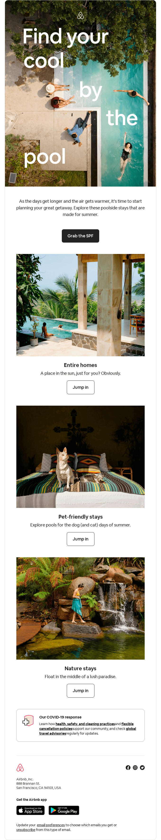 Source: Really Good Emails
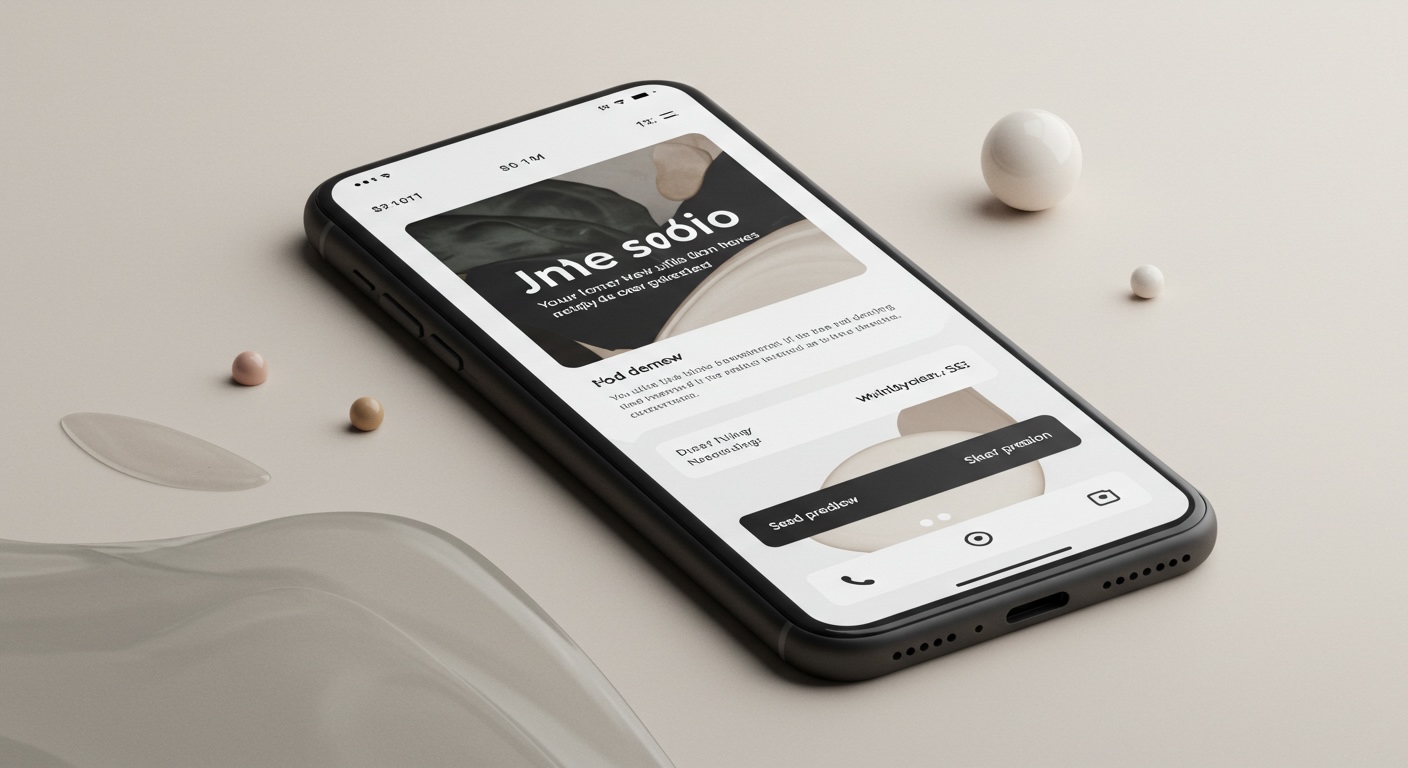
Implementation tip: Start your design with a 320px wide canvas (the width of small mobile screens) to ensure your content works in the most constrained environment.
2. Fluid Images & Scalable Elements
Key concept: Images should resize proportionally based on screen width rather than maintaining fixed dimensions.
How to implement: Use percentage-based widths for images and containers rather than fixed pixel values.
<!-- Responsive image example -->
<img src="product.jpg" alt="Product" style="width: 100%; max-width: 600px; height: auto;">
Real-world example: Starbucks uses fluid product images that resize beautifully across devices, maintaining visual impact regardless of screen size.
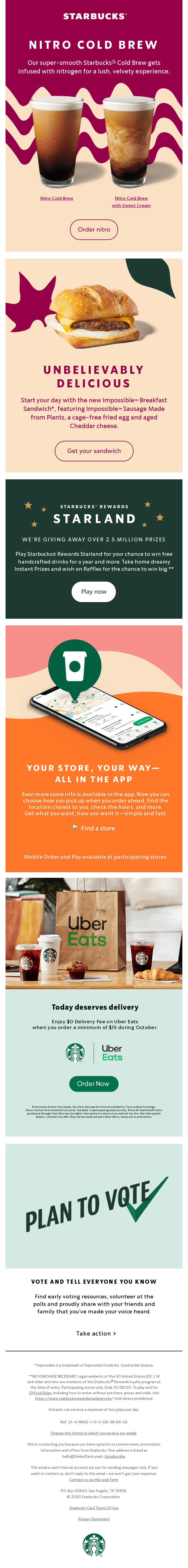 Source: Really Good Emails
Implementation tip: Always set both width and height attributes on images, but override the height with “height: auto” in CSS to maintain proportions.
3. Stackable, Multi-Column Layouts
Key concept: Content arranged in multiple columns on desktop should stack vertically on mobile.
Modern email clients now support CSS media queries, which allow you to create layouts that transform based on screen size.
Real-world example: Nike uses a two-column product grid on desktop that elegantly stacks into a single column on mobile.
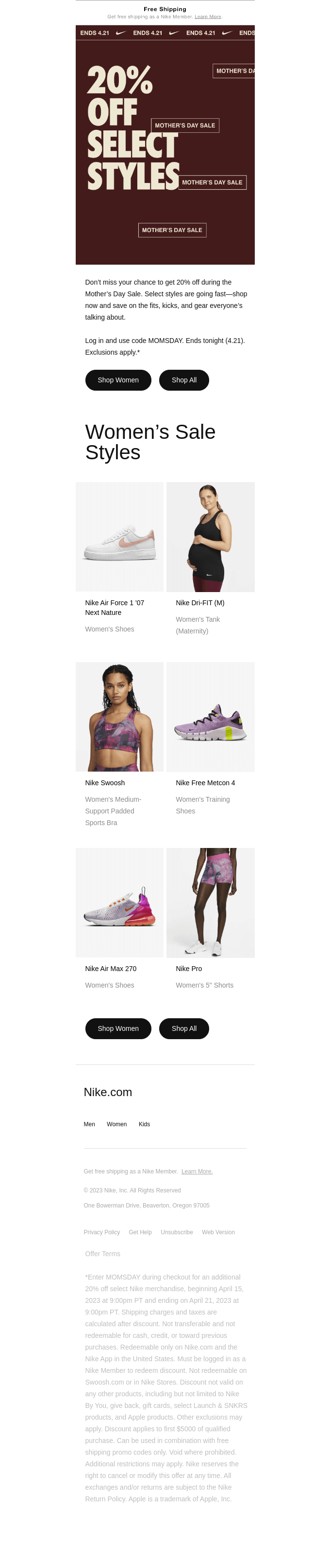 Source: Really Good Emails
Implementation technique:
<!-- Basic stackable two-column layout -->
<table role="presentation" width="100%">
  <tr>
    <!-- Column 1 -->
    <td class="column" width="50%" style="padding: 10px;">
      Product 1 content
    </td>
    <!-- Column 2 -->
    <td class="column" width="50%" style="padding: 10px;">
      Product 2 content
    </td>
  </tr>
</table>

<!-- CSS in the head section -->
<style>
  @media screen and (max-width: 480px) {
    .column {
      display: block !important;
      width: 100% !important;
    }
  }
</style>
Implementation tip: Limit your designs to no more than 2-3 columns on desktop to ensure content remains readable when stacked on mobile.
4. Touch-Friendly Targets
Key concept: Interactive elements should be sized and spaced for finger taps, not mouse clicks.
Apple’s guidelines recommend touch targets at least 44×44 pixels, while Google suggests 48×48 pixels.
Real-world example: Spotify consistently uses large, well-spaced buttons in their emails that are easy to tap accurately on any device.
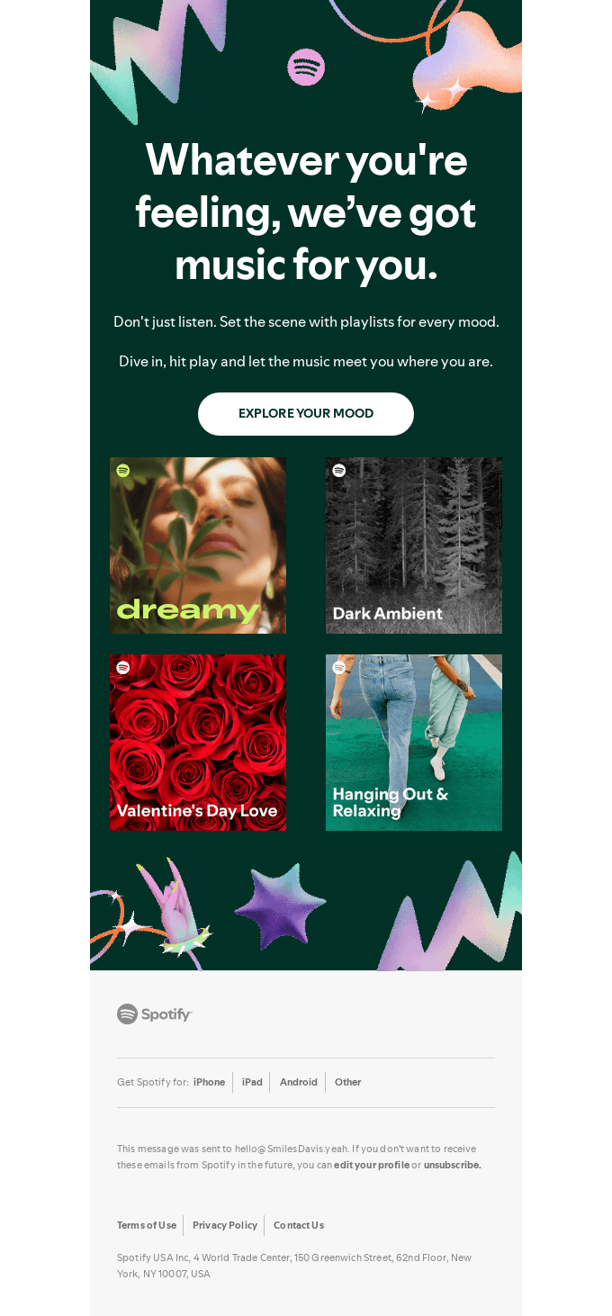 Source: Really Good Emails
Implementation tip: Ensure at least 10px of space between clickable elements to prevent accidental taps on the wrong link.
5. Progressive Enhancement
Key concept: Start with a basic design that works everywhere, then add enhancements for clients that support them.
How it works: By designing a solid baseline experience that functions in all email clients, then layering additional features for modern clients, you ensure no subscriber has a broken experience.
Real-world example: Shutterstock uses progressive enhancement to add interactive elements to their emails that degrade gracefully in less capable clients.
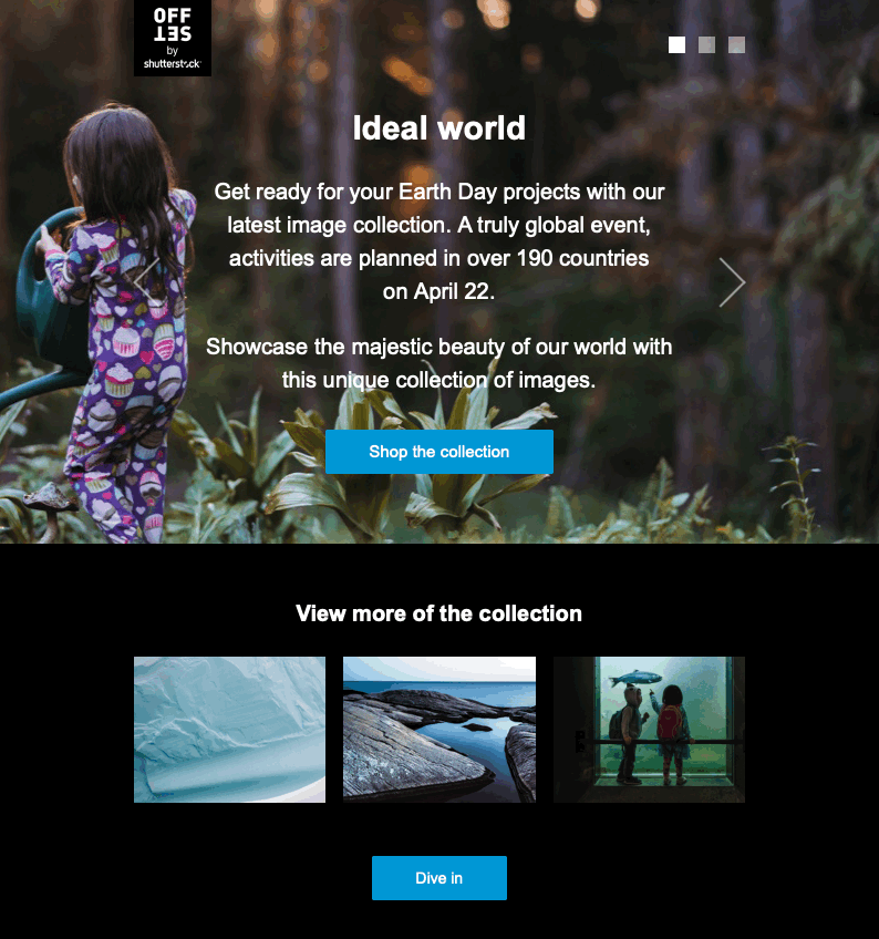 Source: Litmus
Implementation tip: Always test what happens when advanced features like animation, interactivity, or custom fonts fail to load.
Technical Considerations for Reliable Rendering
1. Email-Safe Fonts and Fallbacks
Modern email clients support a wider range of fonts, but you still need reliable fallbacks.
Implementation technique:
font-family: 'Helvetica Neue', Helvetica, Arial, sans-serif;
Progressive approach: Use web fonts with appropriate fallbacks:
@font-face {
  font-family: 'CustomFont';
  src: url('fonts/CustomFont.woff2') format('woff2'),
       url('fonts/CustomFont.woff') format('woff');
  font-weight: normal;
  font-style: normal;
}

body {
  font-family: 'CustomFont', Helvetica, Arial, sans-serif;
}
Real-world example: Asana uses consistent typography with appropriate fallbacks to maintain their brand identity across all email clients.
 Source: Really Good Emails
2. The Hybrid Coding Approach
Modern emails often use a hybrid approach, combining traditional table-based layouts with CSS for better responsiveness.
Key concept: Tables provide structure and layout stability, while CSS handles responsiveness.
<table role="presentation" width="100%" style="max-width: 600px;">
  <tr>
    <td class="responsive-cell" style="padding: 20px;">
      <!-- Content here -->
    </td>
  </tr>
</table>
Real-world example: Slack’s emails use a hybrid approach that creates consistent layouts while maintaining flexibility.
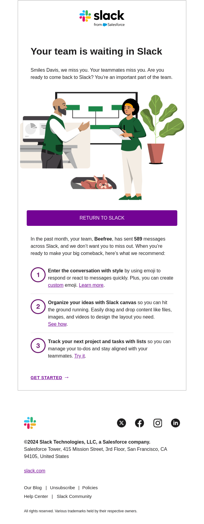 Source: Really Good Emails
3. Media Query Support and Workarounds
Not all email clients support media queries (particularly the Gmail app on some Android devices).
Key concept: Use a combination of media queries for clients that support them and reliable fallbacks for those that don’t.
Implementation technique: The “mobile-first” CSS approach combined with max-width constraints:
<style>
  /* Mobile-first styles that work everywhere */
  .column {
    width: 100%;
    display: block;
  }

  /* Desktop styles that kick in on larger screens */
  @media screen and (min-width: 480px) {
    .column {
      width: 50% !important;
      display: table-cell !important;
    }
  }
</style>
Real-world example: Ebay designs with reliable defaults that look good on mobile without requiring media query support.
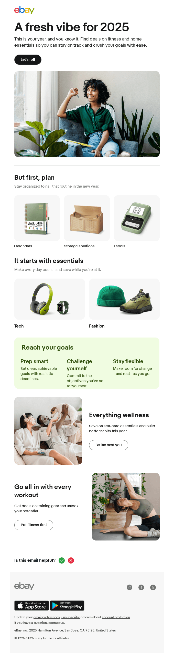 Source: Really Good Emails
4. Dark Mode Considerations
Many modern email clients now support dark mode, which can unexpectedly invert your colors.
Key concept: Design with dark mode in mind by using transparent backgrounds where possible and testing color inversions.
Implementation technique: Use the color-scheme property and specific media queries:
:root {
  color-scheme: light dark;
}

@media (prefers-color-scheme: dark) {
  .email-background {
    background-color: #121212 !important;
  }
  .text-content {
    color: #ffffff !important;
  }
}
Real-world example: Apple’s marketing emails handle dark mode transitions elegantly, maintaining readability and brand integrity.
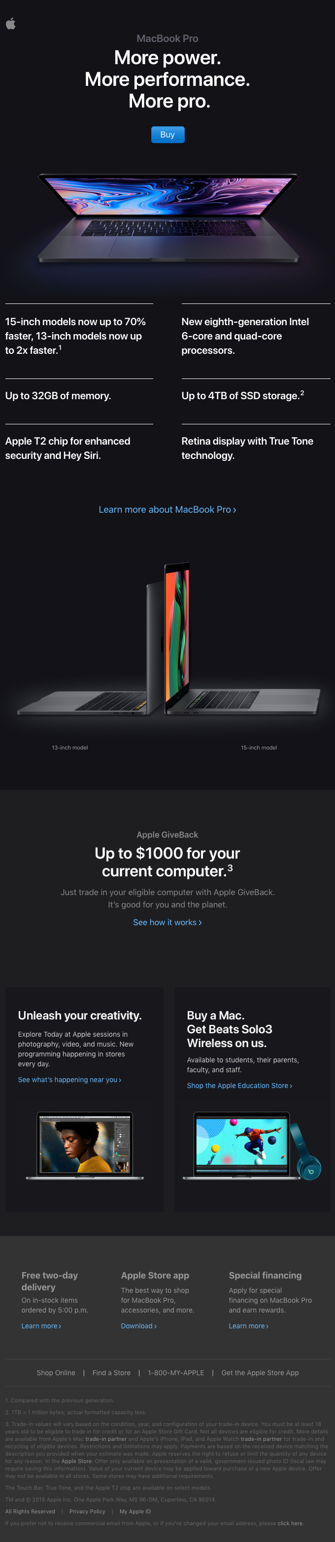 Source: Really Good Emails
5. Image Optimization for Speed
Key concept: Optimize images for fast loading without sacrificing quality.
Email images should generally be under 200KB each, with the entire email under 1MB.
Implementation technique:
- Use WebP format where supported
- Fall back to highly optimized JPGs and PNGs
- Specify dimensions in HTML to prevent layout shifts
Real-world example: Patagonia effectively balances image quality and file size for fast-loading emails with strong visual impact.
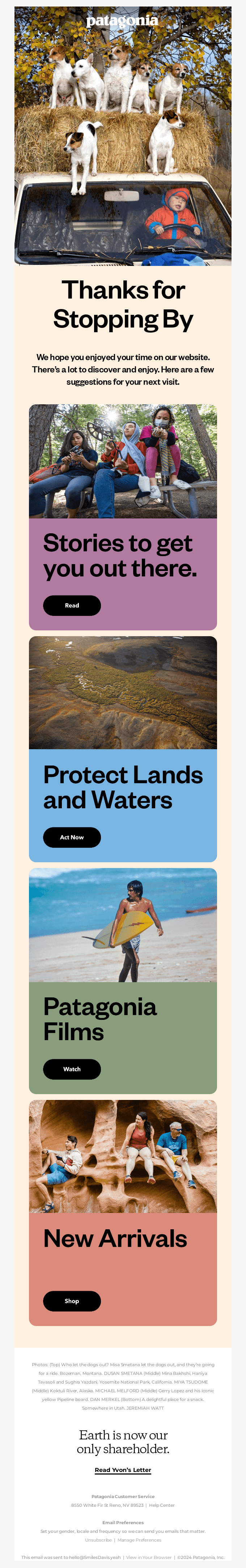 Source: Really Good Emails
Testing Strategies for Modern Email Clients
1. Establish Your Rendering Priority List
Not all email clients deserve equal attention. Here’s a practical approach:
- Must-support tier: iOS Mail, Gmail (web and app), Outlook 365, Apple Mail
- Second tier: Outlook desktop, Samsung Mail, Yahoo Mail
- Legacy support (if needed): Older versions of Outlook, international clients
2. Use Preview Tools Strategically
Implementation approach: Use a tool like Litmus, Email on Acid, or Testi@ to preview across your priority clients.
3. Real Device Testing
Don’t rely solely on preview tools. Test on actual devices when possible, especially for critical campaigns.
Practical Workflow for Responsive Email Design
- Start with content hierarchy - Determine what content is critical vs. nice-to-have
- Design for mobile first - Begin with 320px width layouts
- Enhance for larger screens - Add columns and advanced features for desktop
- Code using hybrid approach - Combine tables for structure with CSS for responsiveness
- Test across priority clients - Verify rendering across your key email clients
- Optimize file sizes - Reduce image weights and overall email size
- Send a test to yourself - Check the email on your own devices before launching
Beyond Responsive: What’s Next in Email Design
Accessibility Considerations
Beyond responsiveness, ensure your emails are accessible by:
- Using semantic HTML
- Maintaining proper color contrast (at least 4.5:1 for text)
- Adding meaningful alt text to images
- Creating a logical reading order
Real-world example: Mailchimp’s own marketing emails demonstrate excellent accessibility practices while maintaining visual appeal.
 Source: Really Good Emails
Interactive Email Techniques
Modern email clients increasingly support interactive elements like:
- Accordion toggles
- Tabbed content
- Image carousels
- Interactive quizzes
Implementation approach: Always use progressive enhancement so these features gracefully degrade in older clients.
Real-world example: McDonalds uses subtle interactive elements that enhance the experience in supporting clients but don’t break in older ones.
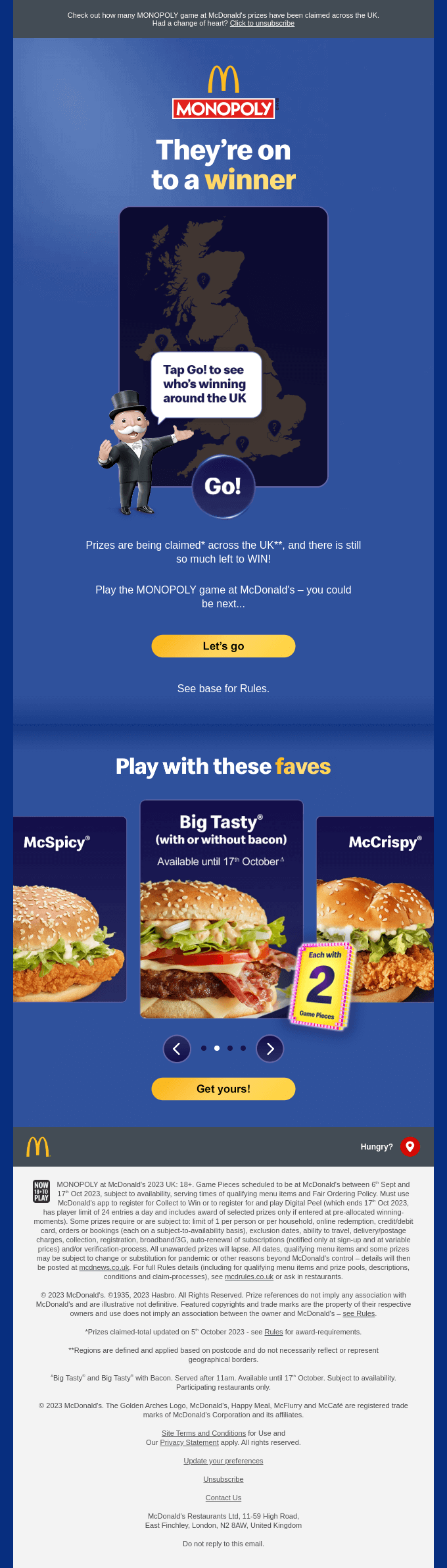 Source: Really Good Emails
Conclusion
Responsive email design remains technically challenging due to the fragmented client landscape, but following these principles will ensure your emails look great across devices.
Remember: start with mobile, use a hybrid coding approach, test thoroughly, and always have a fallback plan for less capable clients. Prioritize your core message and make sure it’s accessible across all devices and platforms.
By focusing on these fundamentals, you’ll create emails that deliver your message effectively regardless of where they’re opened.
Want to see how AI can help you design responsive, beautiful HTML email templates? You should try Emily.email